Visualisation des Billets Vendus
Visualizing Theater History
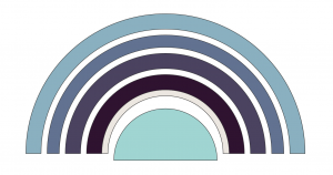
Odéon Theater seating layout
Visualisation des Billets Vendus, a data interactive created by Christophe Schuwey, Lecturer at Université de Fribourg (Switzerland), and Christopher Morse, Senior Research Computing Specialist at DARTH, reveals ticket sales at performances during the 1784-1785 season at the Odéon-Théâtre de l’Europe in Paris. The project was conceived during the May 2016 Pratiques théâtrales & archives numérisées Projet des Registres de la Comédie-Française (1680-1793) conference cohosted by Harvard and MIT.
Inspired by the work of conference presenters Pannill Camp, Associate Professor of Drama at Washington University at St. Louis, Juliette Cherbuliez, Associate Professor of French at the University of Minnesota, and Derek Miller, Assistant Professor of English at Harvard University, Christophe and Christopher deliberated over possible methods of representing an interactive theater space within a browser. Although the project is still in its nascent stages, it has already revealed interesting perspectives on performance attendance.
Thanks to the meticulous recordkeeping of the Comédie-Française, it is possible to reconstruct with some certainty how full or empty the theater was during each performance between 1680-1793. In addition to cast lists, show dates, and other relevant performance information, The Comédie-Française Registers Project database contains digitized receipts of daily ticket sales. Visualisation des Billets Vendus uses this data to reveal how crowded the theater was on a given night in the form of a heat map—the hotter the color, the busier the performance.
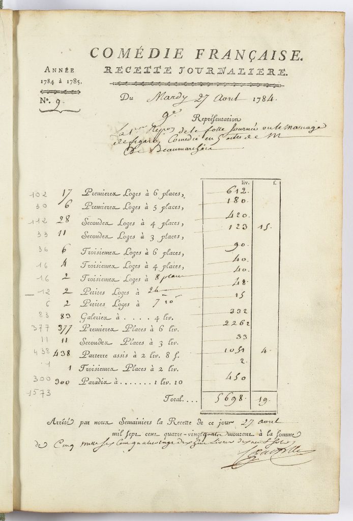
Ticket sales during the opening night of The Marriage of Figaro (April 27, 1784), source.
Designing a Theater
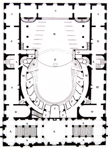
Odéon theater layout, source.
D3JS is a data visualization library built in JavaScript for use in web programming. It was an obvious choice for this particular project because D3 simplifies the task of rendering interactive shapes within the browser and associating them with dynamic data. Using various theater layout diagrams it was possible to abstract the general shape of the theater into a seating chart.
The Odéon consists of several seating areas for which there is recorded data: the parterre assis, galerie, prémier loge, deuxième loge, troisième loge, and at the top of the theater, paradis. Similar to other theaters, each seating area is divided into additional sections. For now, each of the individual seating areas were combined on each floor to create a total count.
Each floor of the theater was represented as an arc and assigned its own unique color. A slider at the bottom of the page allows users to cycle through each performance date, and in the top left there is a legend that helps to distinguish how busy a particular floor was in relation to the others. With every movement of the slider, lines representing each floor will appear on the legend to show how that night’s attendance compares with the entire season.
When The Marriage of Figaro opened on April 27, 1784, after years of rewrites and censorship, the Odéon was completely packed. The floor plan is bright red, save for one row: the troixième étage. Could this be an error in the data, or perhaps attributable to special seating arrangements, or season passes purchased in advanced? With a visual guide to each performance it becomes far easier to discovery and query these inconsistencies.

Seating chart during the opening of The Marriage of Figaro (April 27, 1784)
Continuing the Tradition
Visualisation des Billets Vendus, while still in its early stages, has been an interesting thought experiment in theater representation and history, and presents a number of unique challenges. For example, how should one visualize a theater? Does it suffice to abstract a theater into shapes like a seating chart one might see on a website like Ticketmaster? What can be learned (or not) by specificity, that is to say, by attempting to recreate each individual seating area, or even each seat?
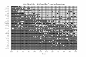
Afterlife of the 1680 Comédie-Française Repertoire, by Derek Miller
Moving forward, the visualization seeks to encompass the entirety of the Comédie-Française registers collection, totaling over one hundred years of ticket sales, and various user interface improvements over time will make it easier for users to work with the heat map in more detail.
In addition to this project, the conference hackathon also inspired a number of other data visualizations and digital presentations, including one by Derek Miller, which can be read here: Four Perspectives on the Comédie-Française Repertoire.