Mapping the Movida

Mapping the Movida: A Digital Humanities Project

by: Vanessa Ceia

Mapping the Movida is an open web archive and geo-spatial project that visualizes the cultural and creative hubs and networks of the Movida, a sociological phenomenon and cultural renaissance that emerged in the first decade of Spanish democracy (roughly 1976-1986), most notably in Madrid. Vanessa Ceia (College Fellow, Harvard University) created Mapping the Movida during her tenure as Visiting Scholar in Hispanic Studies at Brown University in 2015-16. The project is a response to the limited scope of artists— mostly male and active in central Madrid—historically associated with the Movida in mainstream press and scholarship. In its mission to bring to light uncharted human geographies of the period, Mapping the Movida aims to:

(1) re-create the Madrid of the Movida using a range of multimedia, data and thick mapping technologies that not only catalyze the present but also go back in time to document the Madrid of the past;

(2) visualize creative networks and cultural hubs of the Movida through various cultural lenses—including national Spanish media outlets (El País, ABC, El Mundo), scholarly articles, and subcultural publications from the period (La Luna de Madrid, El Víbora, Ozono, Madrid Me Mata, and zines)—to reveal how each lens represents the Movida in different and/or similar ways;

(3) create a public archive and searchable database of Movida events and artists’ documented movements in Madrid during the Movida (1976-1986); and

(4) de-colonize the geographies of the Movida by revealing new spaces, artists, and socio-economic classes that problematize the cultural and spatial canon of the Movida.

Inspired by the thick mapping and visualization projects of Todd Presner, David Shepard, Yoh Kawano, and Johanna Drucker, this project began with a map of the Movida as imagined by Spain’s major news outlets (ABC, El Mundo, El País) and the works of prominent scholars of the Movida and Spanish Transition. This original baseline map was limited to 16 points of interest referenced in 309 articles about the Movida in El País, Spain’s most widely read newspaper. After mining data from events listings and advertisements from subcultural publications and zines from the period, the map of the Movida has expanded to 230 locations in Madrid, including peripheral neighborhoods and largely working-class municipalities such as Alcorcón and Carabanchel. At stake in these findings, are both the cultural geographies of Madrid during this period and the many minority artists who have yet to be studied within the corpus of so-called Movida artists and texts. These include artists such as Moral Dudosa and Acrobacia Terrestre, and locations such as Sala Imperio, about which details can be found in the postings on this site.

It should be noted that, though this project focuses on the greater Madrid Metropolitan Area, the Movida was not limited to the Spanish capital. A number of ‘Movidas’ occured in major cities across Spain’s autonomous communities, particularly in Galicia, Catalunya, the Basque Country, and Andalucía. In future, and in the spirit of de- centralizing the Movida archive, Mapping the Movida will also explore creative networks, key locations, and human geographies beyond Madrid. Key sources for this expansion include subcultural publications such as El Tintimán (Vigo), Star (Barcelona), and Carajillo (Barcelona).

Digital Tools Used: Carto, Esri Story Maps, Google Earth, Google Maps

Data formats: kml, csv

Keywords: Madrid, Movida, mapping, GIS, human geography, data visualization, digital humanities, La Luna de Madrid
Visualisation des Billets Vendus

Visualizing Theater History

interactive_default

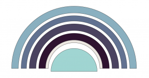
Odéon Theater seating layout

Visualisation des Billets Vendus, a data interactive created by Christophe Schuwey, Lecturer at Université de Fribourg (Switzerland), and Christopher Morse, Senior Research Computing Specialist at DARTH, reveals ticket sales at performances during the 1784-1785 season at the Odéon-Théâtre de l’Europe in Paris. The project was conceived during the May 2016 Pratiques théâtrales & archives numérisées Projet des Registres de la Comédie-Française (1680-1793) conference cohosted by Harvard and MIT.

Inspired by the work of conference presenters Pannill Camp, Associate Professor of Drama at Washington University at St. Louis, Juliette Cherbuliez, Associate Professor of French at the University of Minnesota, and Derek Miller, Assistant Professor of English at Harvard University, Christophe and Christopher deliberated over possible methods of representing an interactive theater space within a browser. Although the project is still in its nascent stages, it has already revealed interesting perspectives on performance attendance.

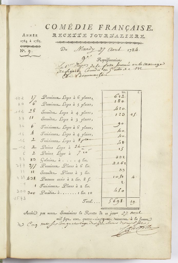
Thanks to the meticulous recordkeeping of the Comédie-Française, it is possible to reconstruct with some certainty how full or empty the theater was during each performance between 1680-1793. In addition to cast lists, show dates, and other relevant performance information, The Comédie-Française Registers Project database contains digitized receipts of daily ticket sales. Visualisation des Billets Vendus uses this data to reveal how crowded the theater was on a given night in the form of a heat map—the hotter the color, the busier the performance.

M119_02_R150_021

Ticket sales during the opening night of The Marriage of Figaro (April 27, 1784), source.

Designing a Theater

Odeon 1re Loges and Galeries

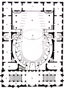
Odéon theater layout, source.

D3JS is a data visualization library built in JavaScript for use in web programming. It was an obvious choice for this particular project because D3 simplifies the task of rendering interactive shapes within the browser and associating them with dynamic data. Using various theater layout diagrams it was possible to abstract the general shape of the theater into a seating chart.

The Odéon consists of several seating areas for which there is recorded data: the parterre assisgalerieprémier loge, deuxième loge, troisième loge, and at the top of the theater, paradis. Similar to other theaters, each seating area is divided into additional sections. For now, each of the individual seating areas were combined on each floor to create a total count.

Each floor of the theater was represented as an arc and assigned its own unique color. A slider at the bottom of the page allows users to cycle through each performance date, and in the top left there is a legend that helps to distinguish how busy a particular floor was in relation to the others. With every movement of the slider, lines representing each floor will appear on the legend to show how that night’s attendance compares with the entire season.

When The Marriage of Figaro opened on April 27, 1784, after years of rewrites and censorship, the Odéon was completely packed. The floor plan is bright red, save for one row: the troixième étage. Could this be an error in the data, or perhaps attributable to special seating arrangements, or season passes purchased in advanced? With a visual guide to each performance it becomes far easier to discovery and query these inconsistencies.

marriageoffigaro

Seating chart during the opening of The Marriage of Figaro (April 27, 1784)

Continuing the Tradition

Visualisation des Billets Vendus, while still in its early stages, has been an interesting thought experiment in theater representation and history, and presents a number of unique challenges. For example, how should one visualize a theater? Does it suffice to abstract a theater into shapes like a seating chart one might see on a website like Ticketmaster? What can be learned (or not) by specificity, that is to say, by attempting to recreate each individual seating area, or even each seat?

1680_repertoire

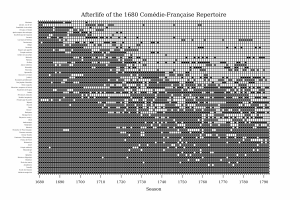
Afterlife of the 1680 Comédie-Française Repertoire, by Derek Miller

Moving forward, the visualization seeks to encompass the entirety of the Comédie-Française registers collection, totaling over one hundred years of ticket sales, and various user interface improvements over time will make it easier for users to work with the heat map in more detail.

In addition to this project, the conference hackathon also inspired a number of other data visualizations and digital presentations, including one by Derek Miller, which can be read here: Four Perspectives on the Comédie-Française Repertoire.

Intellectual Property Resources

On April 1st, 2014, DARTH Crimson hosted a discussion panel called Copyright and Copyleft on intellectual property issues in the digital age. As part of the event, we compiled the following list of resources for anyone who wishes to learn more or troubleshoot their own questions and concerns.

DARTH Resources

Harvard Resources

Lynda @ Harvard

Harvard University has partnered with Lynda.com to provide software tutorials to our community free of charge. To learn more about this affiliation and how you can get an account, check out the official Harvard-Lynda portal at lynda.harvard.edu.

Just What Is PixelSense?

Watch this video for an explanation of how “PixelSense” works on the SUR40 and just what makes it special.

Library Explorer

WHAT IS LIBRARY EXPLORER?
Library Explorer is a beta application developed by Brown University and the Harvard Library, built to facilitate discovery of the Library’s digital collections and to allow our patrons to interact with these collections in new ways.

DEEP ZOOM
Zoom in to see images in greater detail and zoom out to navigate more easily within large images. Say goodbye to unraveling large items such as maps over limited workspaces in libraries. With Library Explorer, your users can work more easily with large and unwieldy items in your collection. Plus, you can avoid further wear and tear!

CREATE HOTSPOTS
Create highlighted points on items for your users to view, interact with and learn more. Hotspots can contain text, images and videos. Involve teachers in the process of creating hotspots as well.

TAKE SNAPSHOTS, ANNOTATE & EMAIL
Capture sections of images by placing two fingers on the table, in the form of a rectangle, to take a snapshot. Take notes on the snapshot and send it to your email account. Annotation activity can later be analyzed by the library to see how items are being used in the collection.

BATCH LOADING
Use the Library Explorer automated upload program to load images and metadata, avoiding manual entry.

OTHER FEATURES
Other functionality is included. For instance, adjust the contrast, brightness and saturation of images. You can associate media items and save items to a makeshift workspace. Library Explorer also includes functionality from Brown’s LADS software to create interactive tours.